DESCRIPTION
Create any type of infographic to be shared on Pinterest as well as the company’s blog.
PROCESS (Programs, Tools, Skills, FOCUS principles)
- I brainstormed ideas until I decided which one I liked most.
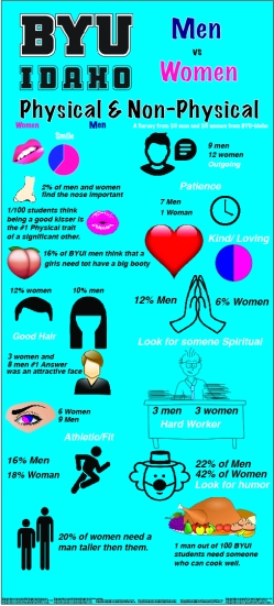
- I decoded on a topic about men and women at BYU-Idaho so I had to interview people all around the school. 50 men and 50 women and ask them what is the number 1 physical and non-physical thing that they look for a significant other.
- I then compiled all the information into excel and made a chart to be used for information on my infographic.
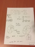
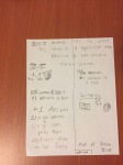
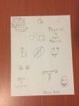
- I then started to sketch my information and how I would organize it. I created one brainstorm sketch and then 2 layout sketches.
- I then started to put my project together in Adobe Illustartor.
- I had to find and add photos, and then make them look good.
- Finally I had to cite all my information and images.
Sketches:
CRITIQUE PROCESS I met with Quinn and Brynn in the Mac Lab at the library. Quinn added a lot of critique that I could make it flow better. Brynn helped me make sure that everything was balanced in color and in weight.
Facebook Critiques: N/A
One-on-One Critique: Quinn
Instructor Critique: N/A
MESSAGE To inform BYU-Idaho students of what people look for in their significant others.
AUDIENCE Anyone who is interested in what the opposite sex wants in their significant other.
TOP THING LEARNED Too much information makes it very hard to flow and look good.
COLOR SCHEME & COLOR NAMES Complementary // Teal and Pink
TITLE FONT NAME & CATEGORY Marker Felt // Script
COPY FONT NAME & CATEGORY Helvetica // Sans Serif
THUMBNAILS OF ANY ORIGINAL, UNEDITED IMAGE(S) USED IN THE PROJECT
N/A
SOURCE OF EACH IMAGE (website name and hyperlink) All on the project itself.

Great job with this project! Your graphics go really well with what your information is saying. You organized your information in a logical way, which is important for inforgraphics.
My blog: https://breezybjohnson.wordpress.com/
Classmate’s blog: https://sophielongblog.wordpress.com/2016/11/03/infographic/
LikeLike
I like the colors in this, they’re very eye popping and I could tell where everything was. like, It flowed really nice.
Also, check out these blogs.
https://kingadamsblog.wordpress.com/
https://parkerhamrick.wordpress.com/
LikeLike
Great job Jeff! I really liked your idea for the infographic, super creative! I also liked all of the graphics, it really made the project pop.
https://sophielongblog.wordpress.com/category/design/
https://translatetocolor.wordpress.com/in-designcomm-130/
LikeLike
Great looking page! I really like your design. Very interesting!
https://gommthebomb.wordpress.com/
https://kingadamsblog.wordpress.com/2016/11/03/infographic/
LikeLike
Hey, I like the graphics you used, and you used a lot of them, too. I think that helped make your graphic more eye-catching; way to go!
A link to my blog: https://parkersmithcommunications.wordpress.com/
And a classmate’s: https://njcwriting.wordpress.com/
LikeLike