PROJECT CORRECTIONS/TIME SPENT
I spent three hours and fifteen minutes on corrections for my Magazine cover and my  Business Identity project.

DESCRIPTION
Create a portfolio with all the projects from my Visual Media class.

PROCESS (Programs, Tools, Skills, FOCUS principles)
1. I made corrections to my projects.
2. I opened InDesign and created my multi-page document.
3. I used Photoshop to make the design and then I placed it in InDesign.
4. I created master pages of the text boxes so that they would be in the same position on each project page.

CRITIQUE PROCESS
Cece helped me with my portfolio and to get the design down. Brinn helped me realize what looks good and what to remove.

One-on-One Critique: Cece

MESSAGE
I want to showcase my work in a professional way.

AUDIENCE
Potential client and employers.

TOP THING LEARNED
This takes a lot longer then you would think.

COLOR SCHEME & COLOR NAMES
Patriotic // Red, White, and Blue

TITLE FONT NAME & CATEGORY
Minion Pro  // Slab Serif

THUMBNAILS OF ANY ORIGINAL, UNEDITED IMAGE(S) USED IN THE PROJECT
texturescom_grungemarbled0027_mtexturescom_inkwide0008_3_moxvjcyh_ldq-chetan-menariaxa-qv4lroew-slava-bowman

Portfolio

12 A: Brochure Project

michael-jordan-brochure-final-frontmichael-jordan-brochure-final

DESCRIPTION

Your employer wants you to design a full-color, folding brochure. The purpose of your brochure may be informational or advertising. You may choose ANY topic. Make this something you enjoy.

PROCESS (Programs, Tools, Skills, FOCUS principles)

  1. I first had to use a piece of paper to try and decide how the layout of my brochure would be. I need to get the dimension of the pages and what will go where.
  2. Then I created my brochure layout in InDesign. I set rulers to know where the fold would be.
  3. I put all the photos that I was going to use in my design on photoshop and had to mask them so they had no background.
  4. I added the photos into my InDesign and created a text warp on them and made sure that they fit well and that none of the text boxes had widows.
  5. I then printed out practice copies of my brochure and folded them to make sure they fit properly.
  6. Finally I made a few tweaks and then printed my design.

CRITIQUE PROCESSI met with Cody Webb and he helped me understand what I needed to do to make sure that the idea would come out the way I planned. He helped me measure and lay out the brochure to be what I wanted.

Facebook Critiques: Daniel Brewer and Logan Thomas

One-on-One Critique: Quinn Nelson

Instructor Critique: My instructor told me to make sure that everything is legible and to have proper fonts and a good color that was legible. She also reminded me of text warps and how I need to have those as well.

MESSAGETo show Michael Jordan and what he has done in his life and his career.

AUDIENCEAll people interested in Michael Jordan on and off the court.

TOP THING LEARNEDIt is really hard to make sure that what you have on the computer is going to work perfectly when it is printed.

COLOR SCHEME & COLOR NAMES  Black and Red

TITLE FONT NAME & CATEGORYBaskerville// Script

COPY FONT NAME & CATEGORYHelvetica// Sans Serif

THUMBNAILS OF ANY ORIGINAL, UNEDITED IMAGE(S) USED IN THE PROJECT

basketball-hoop1983-michael-jordan-001283945 michael-jordan-air-jordan-v-white-fire-red-3 jemlogowhite

michael-jordan-jumpman23 texturescom_woodplanksclean0073_5_m mj

10A Webpage Mockup Project

webpage

DESCRIPTION

Design a website homepage using a grid.

PROCESS (Programs, Tools, Skills, FOCUS principles)

  1. I first thought of an idea for a website.
  2. I then made 3 separate sketches to decide where everything should go.
  3. After my sketches I started to make a wire frame on Photoshop with a 16 column grid.
  4. After my wireframe, I started to add the actual content to Photoshop.
  5. My final project was different then what I had planned. The lay out looked better when I moved the large image just under the header and spread 6 photos on the bottom.
  6. I added a few things to my footer and then had to organize my layers.

scan-2scan-3scan-4webpagewireframe

CRITIQUE PROCESS

I met with Quinn and he helped me to layout my website to make it look nice and flow. The direction the people are looking is all planned so that they can move with the way the people are facing. I had to switch a few of the picture so that the words over top were legible.

Facebook Critiques: N/A

One-on-One Critique: Valerie Shepley

Instructor Critique

My instructor never critiqued my draft but I had the TA at the lab help me. Brinn wanted me to change the top right where the cart is to have a solid background.

MESSAGE
: We can meet any outdoor sports needs.

AUDIENCE
: Anyone who likes to be outside.

LEARNED
: I learned how to organize my layers.

COLOR SCHEME & COLOR NAMES: Analogous// Teal, Blue, and Green

TITLE FONT NAME & CATEGORY: Myriad Pro Bold //San Serif

COPY FONT NAME & CATEGORY
: Myriad Pro // Sans Serif

THUMBNAILS OF ANY ORIGINAL, UNEDITED IMAGE(S) USED IN THE PROJECT

Unsplash.com

photo-1442328166075-47fe7153c128photo-1448526478325-616f2b15b04ephoto-1452772783921-a4e5de72b718photo-1454560291000-ccdbe42e5d49 photo-1465152251391-e94453ee3f5a photo-1471362229315-912f1caf95f7 photo-1477062640650-18e7f1d51eda shopping-cart-371979_960_720 twitter_logo_blue-300x243 facebook-logo instagram_logo-2 magnifying-glass-1141525_960_720

HTML & CSS Coding Project

9ajeffmarshall

DESCRIPTION

Code a custom webpage with HTML and CSS.

PROCESS (Programs, Tools, Skills, FOCUS principles)

  1. I started by designing my logo in illustrator.
  2. I resized my logo to be 300 pixels.
  3. I created my HTML file and started putting all of my own information into it.
  4. I then created my CSS and added all of the colors and things that were asked.
  5. I then validated my HTML and made any necessary changes.
  6. Finally I validated my CSS and made the necessary changes.

CRITIQUE PROCESS
 I met with my roommate Cody who has taken this class before as well as a coding class. He helped clarify some of the things that I was confused about and helped me find some of the mistake that I made.

Facebook Critiques: N/A

One-on-One Critique: Cody Webb

Instructor Critique: N/A

MESSAGE Make your dream a reality.

AUDIENCE
 Anyone who wants to fulfill their dreams.

TOP THING LEARNED
 When coding make sure that everything is saved in the same folder so it can locate all of it.

COLOR SCHEME & COLOR NAMES
 Complementary // Blue  & White

TITLE FONT NAME & CATEGORY Times New Roman // Serif

COPY FONT NAME & CATEGORY Helvetica // Sans Serif

THUMBNAILS OF ANY ORIGINAL, UNEDITED IMAGE(S) USED IN THE PROJECTN/A

SOURCE OF EACH IMAGE (website name and hyperlink)The graphics are my own.

8A Infographic Project

infographic

DESCRIPTION

Create any type of infographic to be shared on Pinterest as well as the company’s blog.

PROCESS (Programs, Tools, Skills, FOCUS principles)

  1. I brainstormed ideas until I decided which one I liked most.
  2. I decoded on a topic about men and women at BYU-Idaho so I had to interview people all around the school. 50 men and 50 women and ask them what is the number 1 physical and non-physical thing that they look for a significant other.
  3. I then compiled all the information into excel and made a chart to be used for information on my infographic.
  4. I then started to sketch my information and how I would organize it. I created one brainstorm sketch and then 2 layout sketches.
  5. I then started to put my project together in Adobe Illustartor.
  6. I had to find and add photos, and then make them look good.
  7. Finally I had to cite all my information and images.

Sketches:

layout-1layout2brainstorm

CRITIQUE PROCESSI met with Quinn and Brynn in the Mac Lab at the library. Quinn added a lot of critique that I could make it flow better. Brynn helped me make sure that everything was balanced in color and in weight.

Facebook Critiques: N/A

One-on-One Critique: Quinn

Instructor Critique: N/A

MESSAGE
 To inform BYU-Idaho students of what people look for in their significant others.

AUDIENCE
 Anyone who is interested in what the opposite sex wants in their significant other.

TOP THING LEARNED Too much information makes it very hard to flow and look good.

COLOR SCHEME & COLOR NAMES Complementary // Teal and Pink

TITLE FONT NAME & CATEGORY
 Marker Felt // Script

COPY FONT NAME & CATEGORY Helvetica // Sans Serif

THUMBNAILS OF ANY ORIGINAL, UNEDITED IMAGE(S) USED IN THE PROJECT

N/A

SOURCE OF EACH IMAGE (website name and hyperlink)All on the project itself.

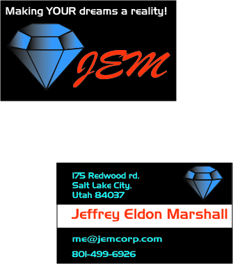
Business Identity

letterheadfinall

businesscardfinal

DESCRIPTION

The company you designed a logo for has asked you to design a business card (front and back) and letterhead using the new logo.

PROCESS (Programs, Tools, Skills, FOCUS principles)

  1. I first sketched all the ideas that I had on a few pieces of paper. I tried to decide which one I liked the best, and made variations of that logo.
  2. I took my designs and created them in adobe illustrator where I was able to tweak the look of them a little bit.
  3. Once I had fully decided on a logo I was able to place that on to my letter  head as well as my business card.
  4. I designed my letterhead and chose specific colors that I wanted and used a water print of my logo.
  5. I then created my business card front and back.
  6. After I received my critique I went back and changed a few things and ended with my final product.

logosfinal

CRITIQUE PROCESS
 I met with McKenna Wilson and Cody Webb and they helped me understand what I needed to change to create a better product. McKenna thought that I should change my water print location and lower the opacity. Cody helped me to change the business card to flow better and to decide what should stick out more.

Facebook Critiques: Daniel Brewer-He liked my color scheme and told me to lower the water print opacity.

One-on-One Critique: McKenna Wilson

Instructor Critique: I was recommended to change my opacity of my water print and to get rid of one of the diamonds that were on my letterhead. I was also told that the name on the logo was hard to read so I changes that as well. I was also recommended to change my business card so that it is all aligned.

MESSAGE
 JEM a place where dreams become a reality.

AUDIENCE
 Anyone who wants to achieve their dreams.

TOP THING LEARNED Illustrator takes a lot of time to get use and it is hard to make everything perfect the way you want it.

COLOR SCHEME & COLOR NAMES
 Complementary // Blue and orange

TITLE FONT NAME & CATEGORY
 Brush Script Mt italic // Script

COPY FONT NAME & CATEGORY
 Newtown// Sans Serif

THUMBNAILS OF ANY ORIGINAL, UNEDITED IMAGE(S) USED IN THE PROJECT

N/A

SOURCE OF EACH IMAGE (website name and hyperlink)

The graphics are my own.

6A Montage Project

6amontagefinalfinal

DESCRIPTION

Design a spiritual poster montage using the blend of images and type

Process

I was deciding on what type of montage I wanted to make. I had the idea of a scry forrest and have Jesus in the light and a Road sign with a quotes on it. Insteas I found this picture of space and an astronaut and wanted to make a quote about how God Exists.

  1. In Photoshop I had to put the background photo and the astronaut together.
  2. I found a a Christian quote I liked “God exists. The proof is in His creation.”
  3. I needed to mask the astronaut into the background.
  4. I needed to make flow from the words, to the planet, to the astronaut, and back to the words again.
  5. Alignment was the last thing I worked with to make sure the flow was still good and the whole project looked good.

Critique Process

I met with Quinn on Monday and he told me that he likes the color scheme and how it all goes well together. Cody helped me figure out what pops out first and where the flow goes from there and how to fix that prior to turning in the final project.

Facebook Critiques: Hannah Murphy

One-on-One Critique: Cody Webb

Instructor Critique: I was recommended to move the words apart and keep the title in the top left and the sub title down towards the bottom left. To also move the astronaut to flow into the words better.

Message

God Exists, and all we have do to is look around and see the creations that he has made to remember Him.

Audience

Anyone who has wondered if there is a God

Top Thing Learned

Flow is very important

Color Scheme & Color Names

Big Split Complementary // Gold, Brick, Violet, Teal

Title Font Name & Category

Oswald Stencil Bold // Decorative

Copy Font Name & Category

Helvetica Light Oblique // Sans Serif

THUMBNAILS OF ANY ORIGINAL, UNEDITED IMAGE(S) USED IN THE PROJECT

astronauts space-star-dust-2560x1440

5A Photodesign Project

5aphotodesignprint

DESCRIPTION

Capture a quality photo with good light, sharp focus, and nice composition. You are asked to submit a full-bleed, 8.5 by 11, photo design project that includes an original, a quality image, a consistent color scheme based on that image, some text, and a few design elements.

PROCESS (Programs, Tools, Skills, FOCUS principles)
:

The steps that I followed in my process were:

  1. I  wrestled with what color scheme I wanted to take and couldn’t decide. So I went out and took a few photos in the gloomy weather we were having. I eventually decided on a picture in the BYU-Idaho Gardens.
  2. I had to do a lot of phot editing to make my color scheme work. I had to make the trees greener, then red leaves more red, and make the brinks look more red as well.
  3. I created an 8.5 x 11 inch Photoshop document.
  4. Then I edited my layers and added text and diagonal boxes coming out from the edge, following the rule of odds.
  5. I then had to balance the picture out to make sure it all looked good.

CRITIQUE PROCESS
:

I met with my roommate Cody who told me that I needed to make my picture more colorful and taught me how to change the layers and edit the photo to make it look the best. I then met with my best friend who gave me some helpful hints on how to balance out the photo and that it looked to much like a Christmas letter, but I couldn’t change my color scheme by then.

Facebook Critiques

One-on-One Critique: Cody Webb and Justin Cook

Instructor Critique: To change the color of my writing, add more boxes, and fix the spelling of Complementary.

MESSAGE
:To take time not to stress and to relax.

AUDIENCE
:Anyone who wants to distress their day.

TOP THING LEARNED:I learned how to use different layers and to create different color effects.

COLOR SCHEME & COLOR NAMES
: Complimentary // Green and Red

TITLE FONT NAME & CATEGORY: Times new roman // Slab Serif

COPY FONT NAME & CATEGORY
: Helvetica // San Serif

THUMBNAILS OF ANY ORIGINAL, UNEDITED IMAGE(S) USED IN THE PROJECT

img_1531

SOURCE OF EACH IMAGE (website name and hyperlink)
: The image is my own.

4C: Photography Activity

jeffmarshall-outsidelight

Light 1: Outside

jeffmarshall-insidelight

Light 2: Inside

jeffmarshallforeground

Focus 1: Foreground

jeffmarshallbackground

Focus 2: Background

jeffmarshall-composition

Composition 1: Thirds

jeffmarshall-leading

Composition 2: Lead room

It was a new experience for me working with leading, foreground and background. I had my camera on manual so there was a lot of tinkering around when it came to lighting inside. I had to change my aperture to make sure that lighting came out well.

I enjoyed taking these photos and using photoshop to edit them. Some of my photos needed a lot more editing, and others almost didn’t need any at all. It was a great activity to get us use to using photoshop.

Prezi Presentation Project

screen-shot-2016-10-05-at-2-00-50-pm

Description-Create an instructional presentation with 10-15 frames. A presentation with more graphic/images and fewer words. Each slide should include a graphic, image or illustration.

Process– I first had to come to an understanding of how to use Prezi because I was use to only using PowerPoint presentations. After a few examples and some help from some tutors Prezi became very easy to work with, except for a few issues that were hard to figure out.

  1. After I looked at some Prezi examples and a few photos I had an idea of what I wanted to do. I first had to start sketching and put my ideas on paper and understand how I was going to get everything to flow and work together.
  2. I used Photoshop and imported my photo and had to use the lasso tool which was a little bit of a hassle but was able to cut out an image of the man I wanted and to get him on a transparent background. There were a few touch ups I had to make because of the lasso tool a few pieces were missing like the ends of the shoes and part of the pants that I had to paint and make them look good again.
  3. Next I inserted my background into Prezi. I worked on where the slides would be and what words to put on each capture. It was a little difficult to get few words to describe what I wanted in each capture, but it is supposed to be mostly visual. I also had to find other photos to place in each of the captures.

scan

Critique Process

As I was in the computer lab in the library I met with Quinn and asked him what I needed to change. He added that it looks great and the symmetry is great, but that I should probably remove some of the words in my 3rd capture because we are supposed to have minimal amount of words. My roommate Cody a visual media major also added that I may want to move my 11th capture because it shows up in the background when changing captures on one of the scenes.

Facebook Critiques-Quinn Nelson and Sariah Mudaliar

One-on-One Critiques– Quinn Nelson and Cody Webb

Instructor Critique-I had to go blind on this one. The Adobe connect was not loading. I tried multiple computers and different internets and nothing allowed it to load.

Message-How men can dress to look stylish and be comfortable.

Audience-Men from the age of 15 to 27

Top Things Learned– Prezi is an awesome presentation tool once you understand how it all works. I will probably use this instead of Microsoft PowerPoint form now on. It is a lot more creative and can be customize and personalized a lot more.

 Color Scheme & color names

Analogous// Teal, Blue. Indigo

Title Font name & Category

Kaushan Script // Script

Copy Font name & Category

Arimo // San Serif

prezi

Source of Images:

https://unsplash.com/collections/201065/him?photo=A8lqGDXkQwM